Overview
Color is one of the most important elements in signage design. It directly affects how easily a sign is noticed, how well it communicates its message, and how customers perceive a business. Choosing the right color combination can significantly enhance visibility and create a strong, lasting impression.

Purpose
To help businesses understand how the right color choices in signage can improve visibility, strengthen brand identity, and attract more customers.
Key Factors in Choosing Signage Colors
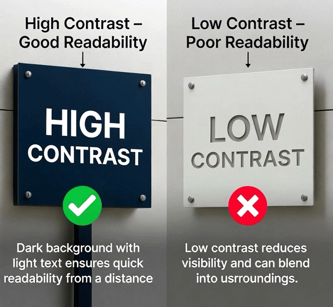
1. Visibility & Contrast
Clear visibility is essential for effective signage. High-contrast color combinations such as dark backgrounds with light text or vice versa ensure that signage can be read quickly and from a distance.
Low-contrast combinations, on the other hand, reduce readability and can cause the sign to blend into its surroundings.
2. Surrounding Environment
The effectiveness of signage colors depends on where the sign is placed. A design that works well in one environment may not stand out in another.
- Busy commercial areas benefit from bold, eye-catching colors
- Minimal or upscale locations often suit more refined and subtle tones
The goal is always to stand out while remaining visually appropriate.
3. Brand Identity
Signage colors should reflect and reinforce the brand. Consistent use of brand colors builds recognition and trust over time.
- Blue conveys trust and professionalism
- Red attracts attention and creates urgency
- Green represents health, nature, and sustainability
- Black & Gold communicate a premium and luxury feel
Capital Arts fabricated this embossed 3D letter “A” using a bright yellow acrylic face with brushed stainless steel sides for a clean, premium look. The translucent acrylic allows the internal LED lighting to glow softly, creating a warm and eye-catching effect. A selection of acrylic color samples is also displayed to highlight the range of customization options available. The result is a simple, strong sign that stands out and lasts long, ideal for businesses wanting to upgrade their brand presence with high-quality signage.
4. Lighting & Visibility (Day & Night)
Signage should remain effective at all times.
- Bright and vibrant colors improve daytime visibility
- Backlit or illuminated signage requires colors that remain clear and legible at night
- Dark color schemes should be paired with proper lighting to maintain readability

Business Impact
Effective color selection in signage can lead to:
- Increased visibility and easier recognition
- Stronger brand presence 🏷️
- Improved customer recall 🧠
- Higher customer engagement and foot traffic 🚶
Conclusion
Color is not just a design choice—it is a strategic decision that directly impacts how a business is seen and remembered. By selecting the right colors for signage, businesses can improve visibility, communicate their brand effectively, and create a stronger connection with their audience.
- Use high contrast for maximum clarity
- Keep color combinations simple and consistent
- Align signage colors with your brand identity
- Consider the installation environment carefully
- Ensure visibility in both day and night conditions
Explore More Work

Takhmao Good Health Hotel

Robin’s Cool Spot Signage